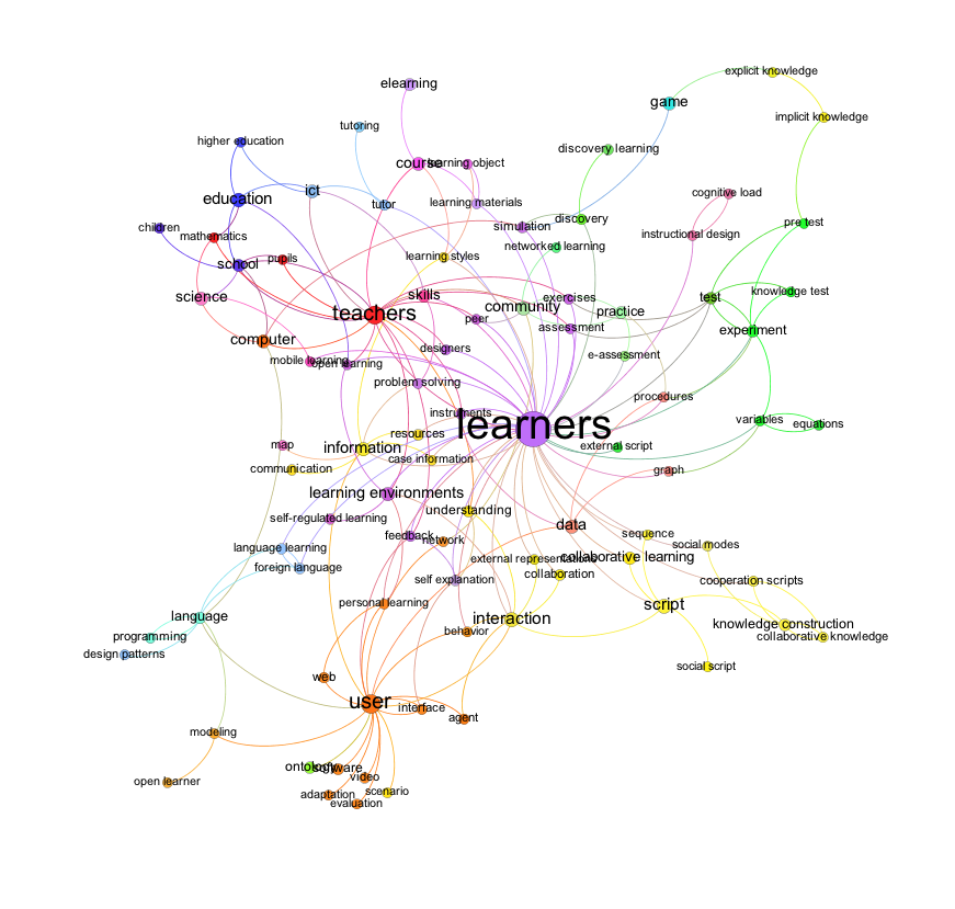
In the first picture, I created a graph without community detection. I filtered the “long tail” of words based on the degree of each node.
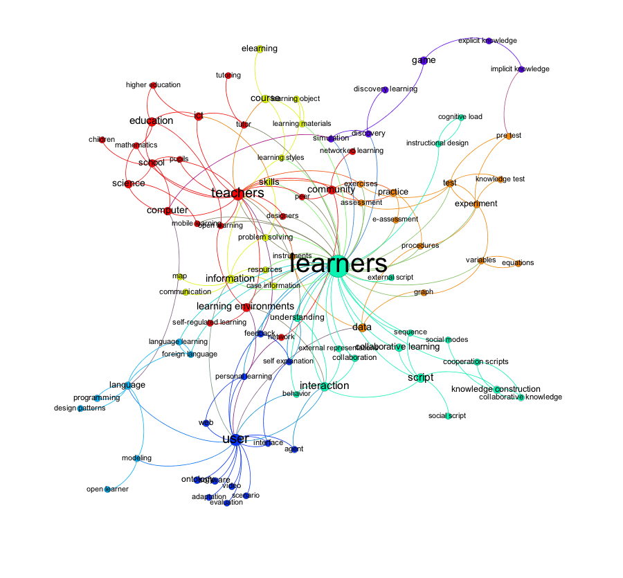
In a next step, I applied a community detection algorithm. A community shows a dense connection within the community and sparse connection between communities. Each community has its own colour. The size of the nodes is still based on the degree of the node.
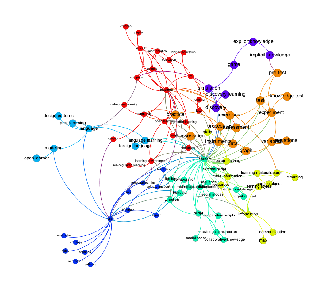
In a last step I changed the ranking for the node size from the node degree to the community degree of each node. Instead of using the degree (in/out-degree) for the size of the nodes, I used the weights of the nodes in each community. This is the difference between the figure two and three and is also the reason for the different layout of the graph.
Just by looking at the last graph, I would say that the connected words make very much sense, and some topics become apparent.


